.png?width=193&height=27&name=ClickPost%20Logo%20(Blue).png)
.svg)
.svg)
.svg)
.svg)
.webp?width=286&height=206&name=ROI%20Calculator%20(2).webp)
.svg)
.svg)
.svg)
.svg)
.svg)
.svg)
.svg)
.svg)
.svg)
.webp?width=286&height=206&name=Frame%201171276203%20(11).webp)
.svg)
.svg)
.svg)
.svg)
.webp?width=286&height=206&name=ROI%20Calculator%20(3).webp)
.svg)

.svg)
.svg)
.svg)
.webp?width=286&height=206&name=ROI%20Calculator%20(4).webp)
Ecommerce Checkout UX: Optimize for Peak Season Performance


Ready to delight customers after checkout?
Trusted by 600+ brands
In this blog
TL;DR Summary
Extra fees revealed late are the single biggest fixable reason shoppers abandon, so fix hidden costs first by showing shipping and tax before the payment step. Offer guest checkout, since forced account creation is a top abandonment trigger and peak season is full of one-time gift buyers.
Cut form fields and design mobile-first, because most mobile orders die in long forms on small screens. Show a real delivery date per shipping option, as accuracy beats speed for most shoppers and vague ranges cost the most during peak.
Finally, harden before the traffic arrives: every fix above should be tested and shipped weeks ahead of Black Friday, not during it.
Introduction
Roughly seven in ten online shoppers walk away from a full cart. Baymard Institute's meta-analysis of around 50 studies puts the average cart abandonment rate at 70.22 percent, and a decade of checkout usability testing suggests that better checkout design alone could recover up to a 35.26 percent lift in conversion for the average large store.
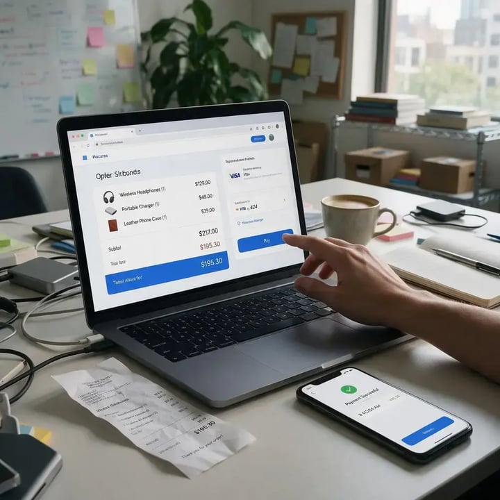
This is a picture from an ordinary week. Peak season keeps the friction and multiplies the traffic, which is exactly why ecommerce checkout UX becomes the line between a record quarter and a wave of lost orders once Black Friday hits.
The scale is not abstract. The 2025 US holiday season became the first to pass $1 trillion in sales, and spending grew about 4.1 percent, landing near the top of the forecast. More volume means more first-time buyers, more mobile sessions, and more delivery anxiety, all hitting a checkout that may have been designed for calmer months.
The fixes below are ordered by impact, starting with the friction that costs the most, and each one closes with the trade-off that comes with it. This article breaks down the checkout fixes that recover the most abandoned carts during peak, what each one takes to implement, and the trade-off it carries so the calls stay yours.
The fixes at a glance
| Fix | Why it works |
Peak-season stakes
|
| Show the full cost early | Hidden fees are the top fixable reason shoppers abandon |
Surprise costs land hardest on high-volume gift orders
|
| Offer guest checkout | Forced account creation blocks first-time buyers |
Peak brings mostly one-time gift shoppers
|
| Cut and mobile-optimize forms | Long forms fail on small screens |
Mobile share and shopper distraction both rise
|
| Add express wallets | One-tap authentication removes form friction |
Patience runs thin when shoppers are rushed
|
| Build in trust signals | Payment-security doubt drives late drop-off |
New shoppers do not yet trust the brand
|
| Accurate delivery date per option | Accuracy matters more than raw speed to most shoppers |
Gift deadlines and carrier delays collide
|
Why peak season punishes checkout friction
A checkout that loses two percent of orders in July loses far more than two percent of revenue in late November, because the traffic behind it is larger and the buyers are more valuable.
Three forces stack up at once during peak. Volume rises, so any per-order friction repeats across far more sessions. The buyer mix shifts toward gift shoppers and first-timers who have no saved account and much less patience. Delivery uncertainty climbs at the same time, because carrier networks slow down exactly when the cutoff for on-time arrival matters most.
None of these are new problems. Peak season simply raises the price of leaving them unsolved. A confusing form or a surprise shipping fee that a loyal customer tolerates in spring will send a stressed holiday gift buyer straight to a competitor with a clearer flow.
Treating checkout as revenue infrastructure, rather than a form to be finished, is what separates the stores that convert their extra traffic from the ones that merely absorb it.
Why do shoppers abandon checkout?
Shoppers abandon checkout mostly for fixable reasons. Once you set aside those who were only browsing, the leading causes are unexpected extra costs shown late, forced account creation, an overly long or complicated flow, and doubts about payment security. Each is a design choice, not a fact of ecommerce, which means each can be changed before peak.
That reframing matters because it turns abandonment from a marketing problem into an engineering and design one. Recovery emails can win back a distracted shopper, but they cannot fix a checkout that quoted a surprise fee.
The fee is still there when the email lands. The higher-impact move is to remove the friction inside the flow first, then let recovery work on the smaller pool of shoppers who left for reasons you cannot design away.
The checkout UX fixes that move conversion
Show the full cost early
Hidden costs are the most expensive mistake in checkout. When shipping, taxes, and fees appear only at the payment step, a shopper who felt ready to buy suddenly feels misled, and many leave. Surface the total, including estimated shipping and tax, before the flow begins, ideally in the cart. Baymard's testing also shows most checkouts can remove 20 to 60 percent of their form elements without losing anything the order needs, and clearer cost disclosure is part of that simplification.
Trade-off: Showing shipping cost upfront can scare off price-sensitive shoppers earlier in the flow. That is usually the intended outcome, because it moves the drop-off to a cheaper stage and protects the shoppers who continue from a late-stage surprise that damages trust.
Offer guest checkout
Forcing account creation is one of the fastest ways to lose a first-time buyer, and peak season is full of first-time buyers purchasing gifts they may never buy again. Guest checkout removes that wall.
Offer account creation after the purchase, as a one-click option on the confirmation page, where the shopper has already committed and entered most of the required detail. The order still gets captured, and the relationship can still begin, without the sale being held hostage to a password.
Trade-off: You collect fewer accounts at the moment of purchase. In practice the post-purchase prompt recovers most of them, and an order with a guest email beats an abandoned cart with no email at all.
Cut form fields and design mobile-first
Every field is a chance to lose someone, and small screens punish long forms hardest. Mobile carts abandon at a markedly higher rate than desktop, so the checkout that matters most is the one on a phone in a distracted moment.
Collapse separate name fields, auto-fill address details from the postcode where possible, trigger the correct mobile keyboard for each input, and default to a single-column layout. Ask only for what fulfillment and payment genuinely require, and question every field marked optional.
Trade-off: Dropping fields can cost you marketing data such as phone numbers or preferences. Capture that later, after the sale, rather than spending checkout attention on data that does not move the order forward.
Add express wallets and payment choice
Digital wallets such as Apple Pay, Google Pay, and Shop Pay collapse the entire form into a single authentication, which is the closest thing to a one-tap checkout on a phone.
Place them prominently at the top of the payment step, not buried beneath the card form. Beyond wallets, match payment methods to the regions you sell into, because a shopper who cannot pay the way they expect will abandon even a well-built form.
Trade-off: Each wallet and method adds a little integration and reconciliation overhead. The conversion gain on mobile almost always outweighs it, but keep the list to the methods your customers actually use rather than every option available.
Build trust into the payment step
Payment-security doubt is a real abandonment cause, and trust signals cost almost nothing to add. Put recognizable security and card-network badges near the payment fields, keep the URL and branding consistent through the flow, and avoid redirecting to an unfamiliar domain.
Inline validation matters just as much. Errors should appear next to the field as the shopper types, with plain language about what to fix, rather than a single red banner after they press submit.
Trade-off: Overloading the page with badges can look desperate and slow it down. A few credible, relevant signals near the payment fields do more than a wall of logos.
Show an accurate delivery date for each shipping option
This is the fix most checkout guides skip, and it is the one peak season rewards most. 62 percent of consumers say an accurate estimated delivery date matters more than fast shipping, according to Pitney Bowes survey data. A specific date does the mental math for the shopper and replaces uncertainty with a decision.
A vague range like five to seven business days forces them to assume the worst, which is fatal when they are buying a gift that has to arrive before a holiday.
Accuracy is the whole game, and it cuts both ways. A delivery date is a promise, and peak season is when promises break, because carrier networks slow, warehouses hit cutoffs, and blackout dates pile up.
A date pulled straight from a carrier's best-case SLA will be wrong on a congested lane in December. Early arrivals are not a safe error either, since 59 percent of shoppers find deliveries that come earlier than promised an inconvenience.
The date shown at checkout should account for handling time, real carrier performance on the actual lane, and a realistic peak-season buffer, and it should change when a shopper upgrades shipping, or the upgrade feels pointless and the promise feels fake.
Trade-off: An honest peak-season date is sometimes slower than the one a competitor advertises. A date you keep beats a faster one you miss, because the missed promise turns into a support ticket, a refund request, and often a customer who does not come back.
Your pre-peak checkout hardening checklist
Every fix above should ship weeks before your first big traffic day, tested under load, not deployed live during Cyber Week. A practical sequence:
1. Audit the current flow on a real phone, as a guest, buying one item and paying. Note every field, tap, and surprise.
2. Move all cost disclosure into the cart, and confirm shipping and tax appear before the payment step.
3. Turn on guest checkout and shift account creation to the confirmation page.
4. Remove or merge every form field that fulfillment and payment do not strictly require.
5. Enable at least two express wallets and confirm they sit above the card form.
6. Wire delivery-date estimates to real handling and carrier data, then add a peak-season buffer and blackout dates.
7. Add inline validation and place visible trust signals at the payment step.
8. Load-test the checkout and every system feeding it, including delivery-date and payment calls, at several times your expected peak.
9. Stand up analytics that track completion rate and drop-off by step, split by device, before traffic arrives.
How to measure checkout UX
You cannot fix what you cannot see. Track checkout completion rate as the headline number, then break abandonment down by step to find where shoppers actually leave. Segment everything by device, because a healthy desktop figure can hide a broken mobile flow.
Watch the gap between add-to-cart and order-placed across the whole peak window, and compare it with the same window last year rather than with a quiet month, since peak behavior is its own baseline.
When a single step shows a sharp drop, that is your highest-value fix, and peak season hands you the traffic to see it clearly and act fast. A change that would take a month to read in July can be significant within days in late November. Instrument the flow before the rush so the data is already flowing when the decisions matter.
Checkout is where the post-purchase promise starts
Checkout is usually treated as the finish line for conversion work. It is better understood as the starting line for the post-purchase experience. The shipping option a customer picks, the delivery date they were shown, and the cost they agreed to all become expectations the moment they place the order.
Peak season is when those expectations are hardest to meet and most expensive to miss, because a late gift produces a WISMO ticket, a support call, and frequently a lost customer.
That is why the delivery promise made at checkout and the tracking experience that follows should run on the same data. A brand that shows an accurate date at checkout, then keeps that promise visible through fulfillment and delivery, converts better and spends less on support at the same time.
ClickPost is the platform brands graduate to when that link between checkout and post-purchase has to hold under peak load, turning carrier performance data into accurate delivery estimates and proactive tracking that protect both the sale and the relationship behind it.
Conclusion
Peak season does not create new checkout problems. It exposes the ones already there and charges full price for them. The stores that win the quarter treat checkout UX as revenue infrastructure, fix the costly friction first, and make a delivery promise they can keep once carrier networks are under strain.
Start with cost transparency, guest checkout, and mobile forms, then connect the delivery date at checkout to the post-purchase experience behind it. Ship it all before the traffic arrives, measure by step and device, and let the record volume work for you instead of against you.
Frequently asked questions
How do I reduce cart abandonment during peak season?
Start with the friction that costs the most. Show all costs, including shipping and tax, before the payment step. Offer guest checkout, cut form fields for mobile, add express wallets, and display accurate delivery dates. Ship and load-test every change weeks before your first big traffic day.
What is a good checkout conversion rate?
There is no single benchmark, since rates vary by industry, device, and price point. A more useful target is your own trend. With average cart abandonment near 70 percent, most stores have room to improve. Track completion rate by device and compare against your prior peak season, not a quiet month.
Why do customers abandon checkout?
Excluding shoppers who were only browsing, the leading fixable causes are unexpected extra costs shown late, forced account creation, an overly long or complicated flow, and doubts about payment security. Each is a design decision rather than an unavoidable cost, so each can be changed before peak season arrives.
Does showing a delivery date at checkout increase conversion?
Yes, when the date is accurate. Most shoppers value an accurate delivery date over raw speed, and a specific date reduces the uncertainty that drives late-stage abandonment. The risk is showing a date you cannot meet, so estimates must reflect handling time, real carrier performance, and peak-season buffers.
Should brands offer guest checkout?
Yes. Mandatory account creation is one of the top abandonment triggers, and peak season brings many first-time gift buyers who will not create an account to complete a single purchase. Offer guest checkout, then invite account creation on the confirmation page once the sale is already secured.
How many fields should a checkout form have?
As few as fulfillment and payment genuinely require. Baymard's testing shows most checkouts can remove 20 to 60 percent of their form elements without losing needed information. Merge name fields, auto-fill address details where possible, and question every optional field, especially on mobile where long forms hurt most.
What causes mobile cart abandonment?
Mobile abandons at a markedly higher rate than desktop, driven by long forms on small screens, fiddly typing, slower loads, and payment friction. Express wallets, a single-column layout, correct mobile keyboards, and auto-filled address entry all reduce it. Test the flow on a real phone, as a guest, before peak.
How do I prepare my checkout for Black Friday and Cyber Monday?
Ship every UX fix weeks early, then load-test. Confirm costs show before payment, guest checkout is on, forms are trimmed, wallets are enabled, and delivery dates reflect real handling and carrier data with a peak buffer. Set up step-level, device-split analytics so you can spot and fix drop-offs fast.





We use cookies to keep the site working, understand usage, and improve your experience. Learn more
Always active for essential site performance and security.
Enables anonymous usage analysis to refine our services.
Used to present relevant promotions and advertising.